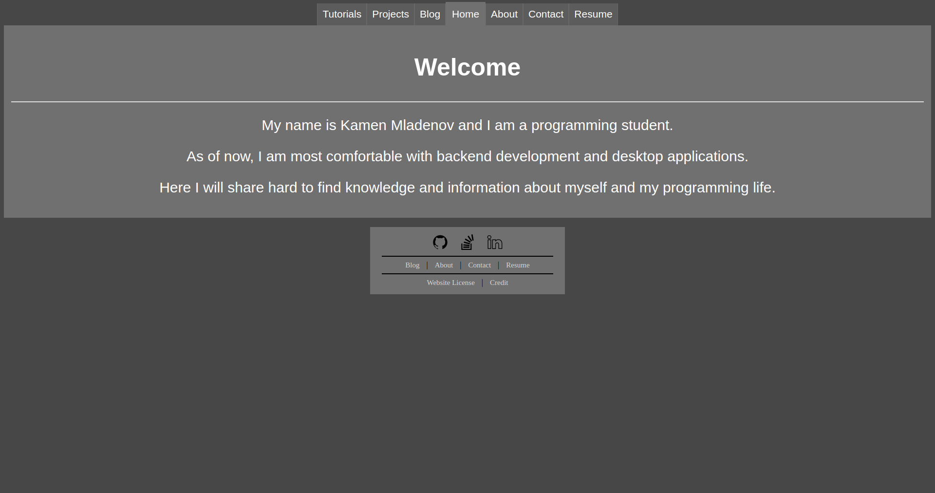
2.6 years of web design
On 17 May 2020 I pushed the very first version of this website, which went live 3 days later. The whole idea of making my own website came on a whim: I had recently turned 18 and spent some of my money on getting a small VPS (which was primarily used for cloud storage). There was no plan and I had never done anything like it, so a shitty website was to be expected.
v1.0
#Looking back at it now, that first design’s color palette was comprised of three dull grey colors, which didn’t contrast very much on the white font:
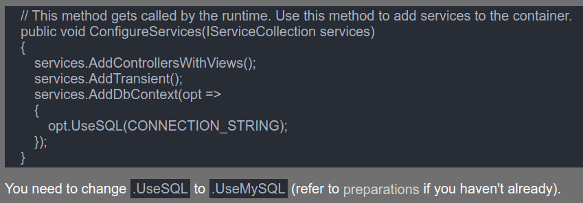
For code blocks, the background was a dark-blue color with a blue-ish font color, absolutely horrible for readability:
Although I wasn’t the one to invent that color scheme, it was inspired from xed’s Oblivion theme.
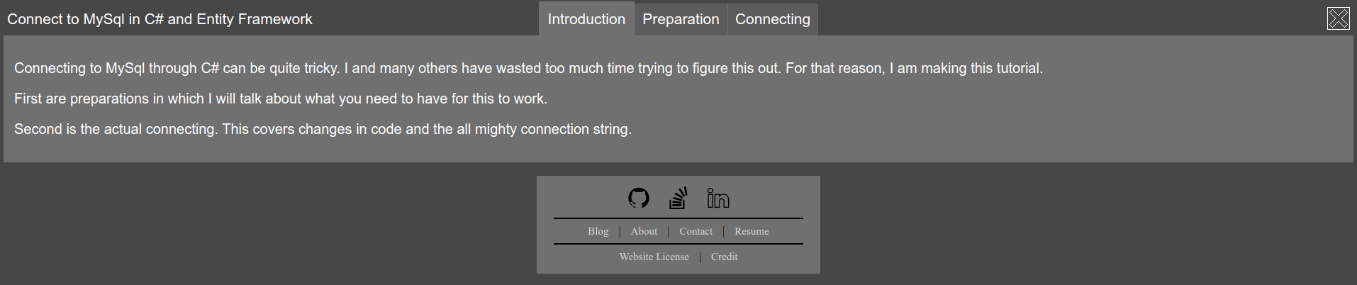
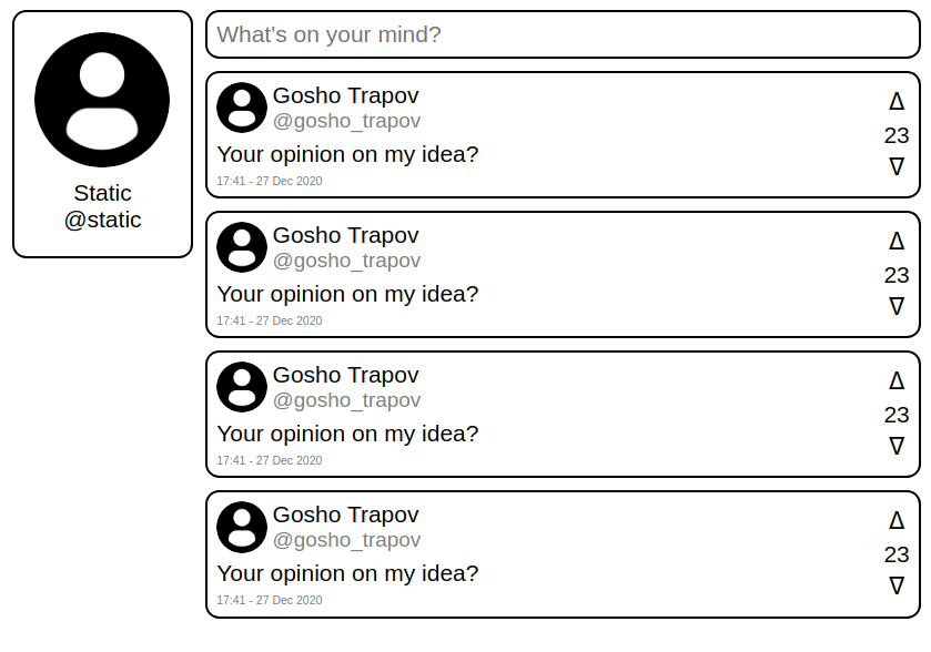
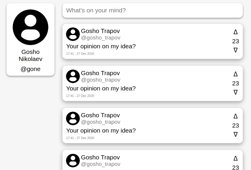
It wasn’t all completely bonkers, there were some not-so-ugly design decisions. Navigation was done with tabs, which look decently nice on a desktop. On blog posts, and especially on those with multiple pages, you would have the title on the left, and a close button on the right, “mimicking” a browser window.
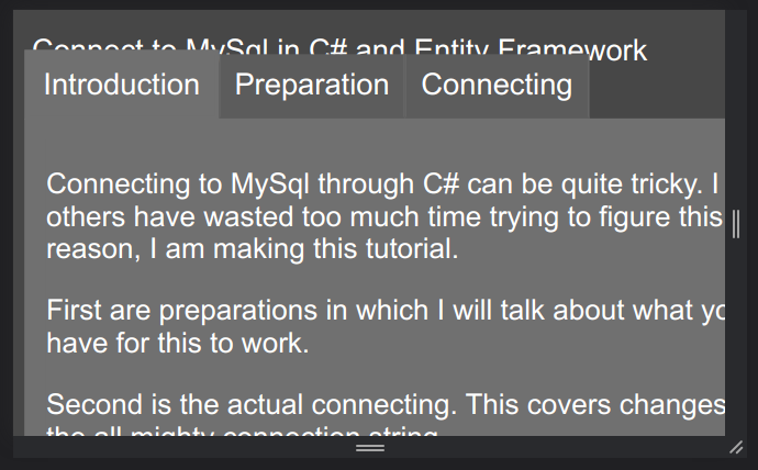
As you can imagine, this was a scalability nightmare. If the title was too long or there were too many pages, stuff would overlap in an unreadable manner:
You know, if this website was published on neocities, my desktop-oriented unscaleable layout might’ve been seen as cool and novel… Thankfully (or maybe unfortunately), I didn’t go down that road.
Finally, tables, like those used in the “Projects” listing, were the absolute dumbest:
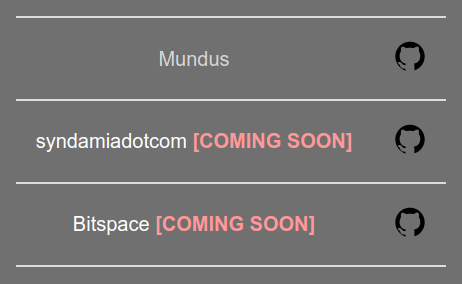
As you can see, the design was overwhelmingly ugly, with many boneheaded decisions behind it. Did I mention every post had to be written entirely by hand in HTML, except for the headers and footers, which were generated client-side with JavaScript?
Nonetheless, it served as a good starting point and stepping stone, for my web development adventures.
v2.0
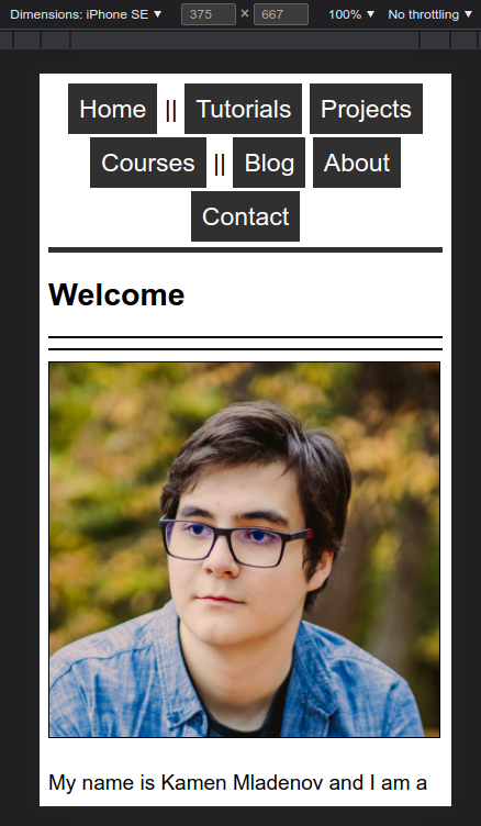
#Less than two months later, on 21 July, I did a complete redesign. To more easily separate the two, I decided to use releases, where a major version would signify a major styling change, and minor versions would be reserved for other important changes, like how the whole website is generated.
Speaking of generated, I actually went away with the old “system” of manual labour, and turned to technology for aid. It’s all thanks to Wolfgang’s Channel’s tutorial on making a “Fast & Minimal Blog”. There, he showed how to setup and use ssg with lowdown, a combination that still powers this website.
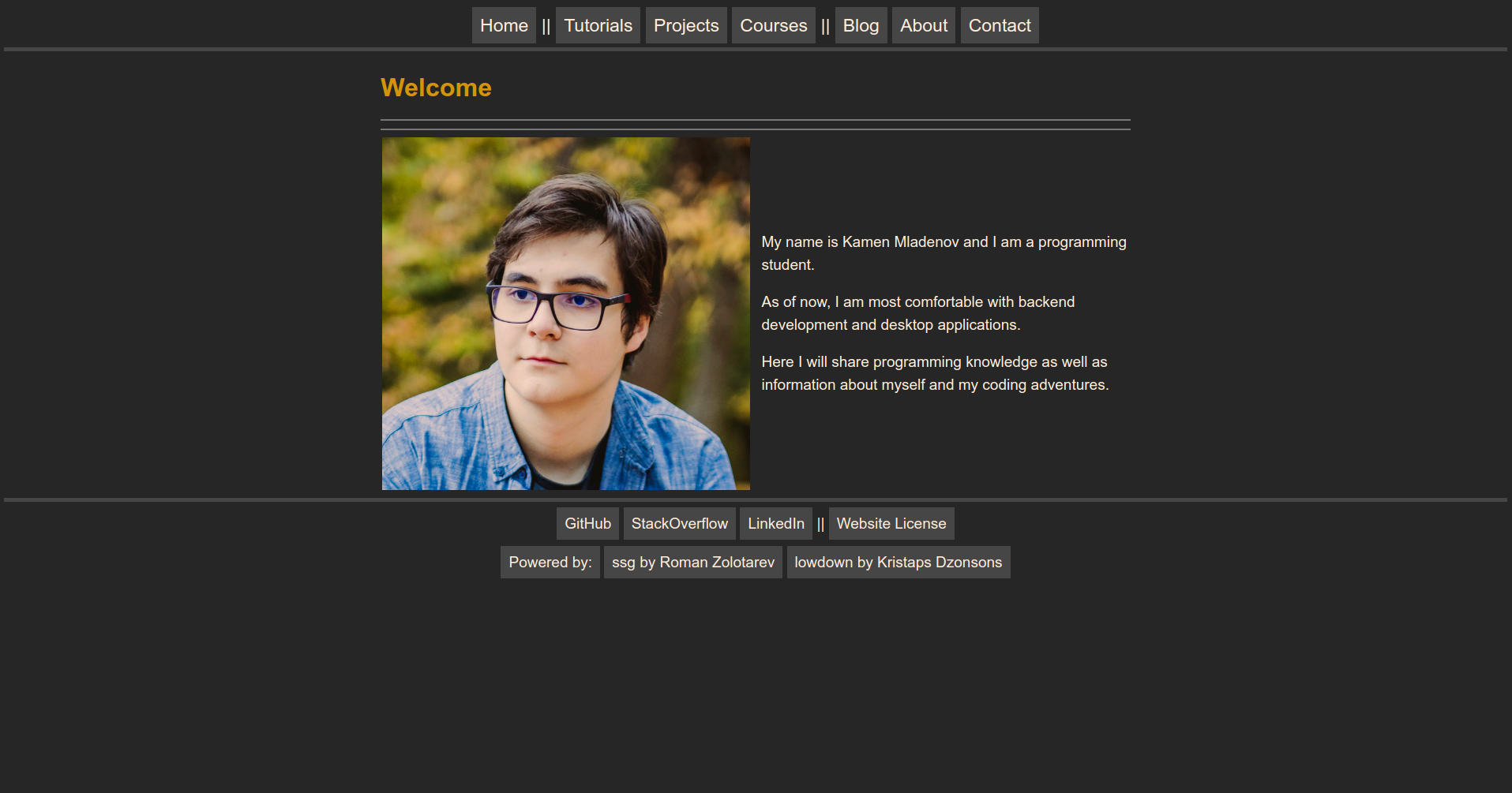
Turning to the actual website itself, now it looked quite pleasant, in the day at least:
Rather than using multiple colors for different elements, I went for a monochrome “printed on a piece of paper” look. One might call that regression, but I’d like to think of it as minimalism.
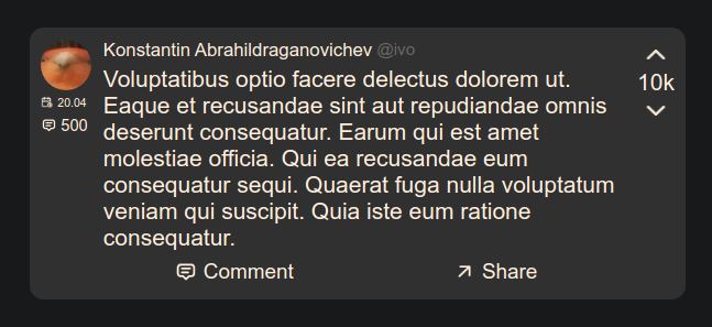
Looking at those same code blocks and tables:
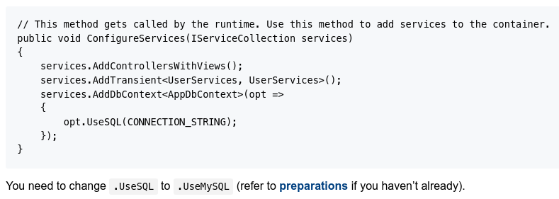
Ay, that’s pretty clean! But it should remind you of something. Before, the only time I would work with Markdown files was in GitHub READMEs. So, with that association in place, replicating GitHub’s style was a natural choice. Though that last part wasn’t done by me, but by sindresorhus.
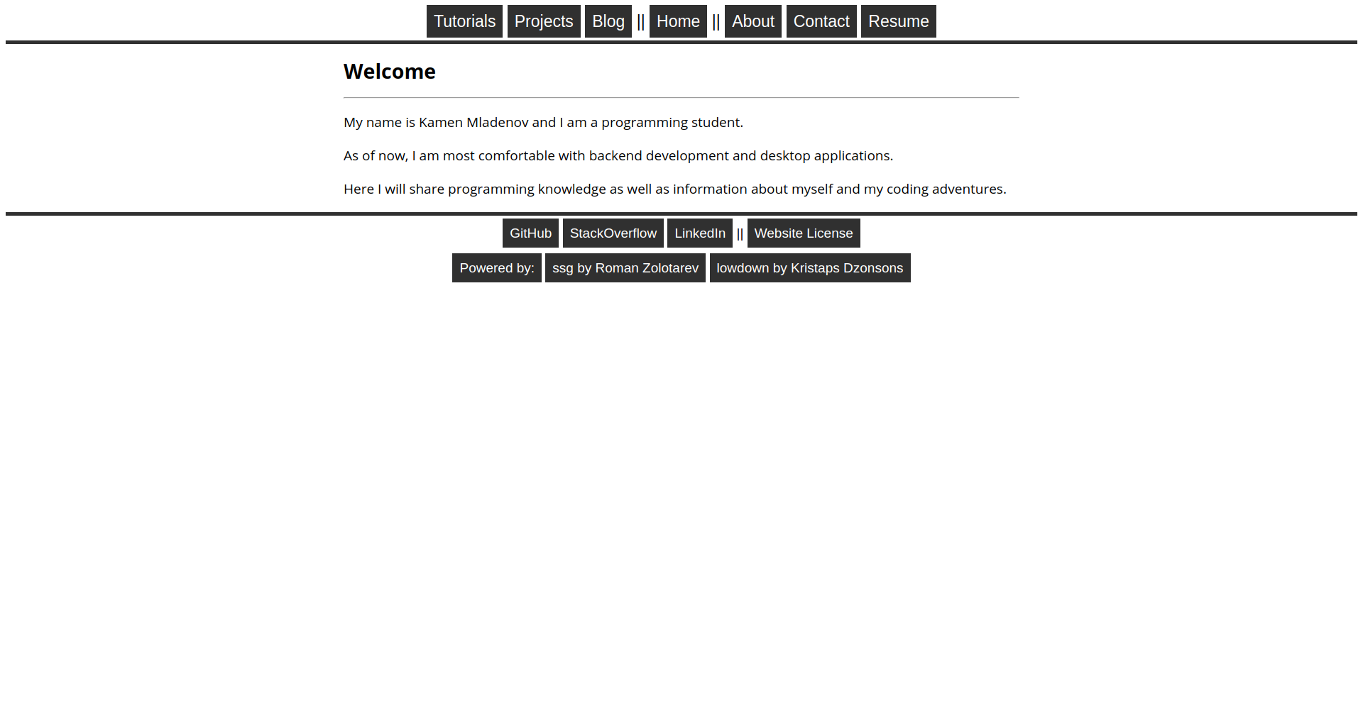
As for the overall design, there isn’t too much to say. Yes, the original tab idea kinda lived on, as those buttons at the top, and yes, it still wasn’t scaleable, but now it didn’t even try to be.
Overall, this made it more “commercialized”, soulless (assuming v1.0 had one) and plain old boring. It seems I hit the other end of the spectrum, from ugly but interesting to pleasing but dull.
v2.1
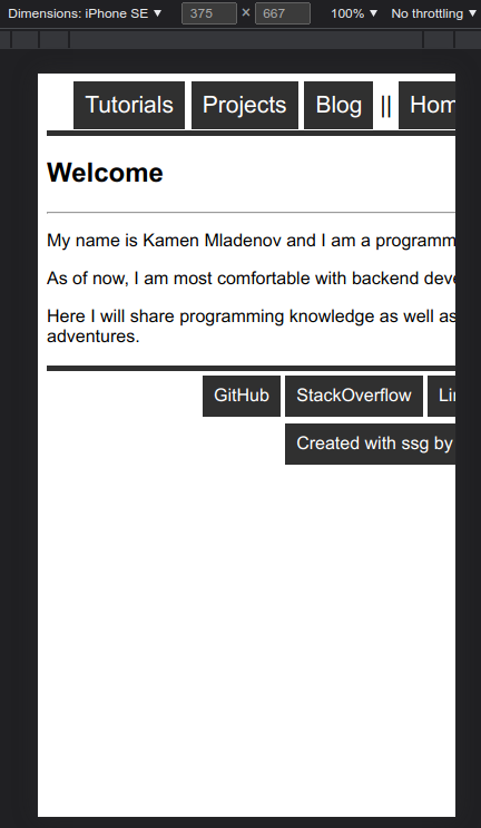
#Over the following half a year, I wrote a couple more articles, but most importantly the styling was finally made scaleable:
Ignoring my big fat head taking up 70% of the screen, the index page properly fit on a mobile screen! The navigation tabs weren’t very symmetrically organized, but at least nothing was overlapping and overflowing over the screen.
v2.2
#Still, by that time I started to get criminally bored by that black and white appearance. As an avid fan of not hurting my eyes and gruvbox, a color overhaul needed to be done.
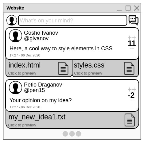
But I’m getting ahead of myself, we need to sidetrack to a project I was working on at the time of 2.1’s release: DevHive. Sparing you the details, it was a social media app, with detached front-end and back-end. Me and two other guys worked on it for about 5 months, from December 2020 to April 2021, as a course project.
Up until this point, the course I’m talking about almost didn’t touch front-end design. As you might imagine, I was the only one with any idea of web design, meaning I was the “lead designer”.
This time, however, I wanted to do it a bit more properly, so I made mockups of the final design. The first was done in Pencil, a somewhat limited application for designing layouts:
Pretty quickly I turned to actual HTML and CSS, because I needed a more realistic feel of how the actual elements would be laid out. Another idea that came up to mind was using a palette: a certain selection of colors for everything. After talking with the others, I found a decent selection of blue and orange sunset-y colours and got to work. The end result was this beauty:
Although it looked pretty nice, we decided against it, since the focus was on the back-end, the front-end needed to be simpler. There are also some problems with the color scheme, but more on that later.
Then I did what I had already done before: simplified the devil out of it.
Now this looks way too cartoon-ish, you could make it with a steady hand and a ruler on a sheet of paper. However it made the others happy, so we went along with it.
The overall flatness and emptiness, and general boringness bugged me for a while. Some time later, after messing around for a couple hours, I came up with this:
A much more modern-looking and feeling concept, completely different from it’s comic roots. Unfortunately, we didn’t go with it, later we found out it had some issues with certain elements, and the previous idea was already implemented.
Why am I telling you all of this? I believe those concepts served as good teaching tools and displayed very well how my design sense changed and improved.
The second showed how certain color contrasts are too distracting, like vibrant orange borders on dark blue background. The third scheme really showed how separation between items comes not only from shape, but also from overall color composition, and how both come hand in hand. The fourth hinted at the idea of height, how certain elements need to look and feel above others.
Of course, this isn’t novel in any way, real designers probably learned these ideas in the very beginning. But as someone who isn’t really interested enough to spend time on proper education and training, these were very important notions.
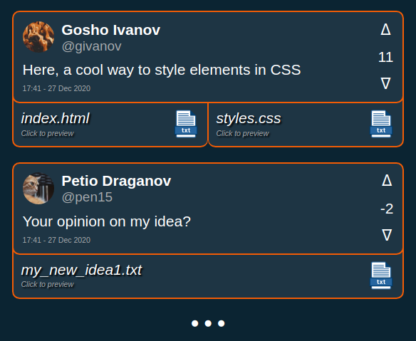
Some time later, we were required to change the design, so I got to thinking. I needed something in between the second and third concepts, something which wasn’t as flat as the third, but also wasn’t as noisy/heavy as the second.
Coincidentally, at the same time, I was working on a dark colored implementation of my website, using the gruvbox color. Putting two and two together, I came up with this thing;
Now this looked really nice, somewhat professional even, was very simple and didn’t hurt your eyes. Suffice to say, everyone loved it, and we redid everything to look like it.
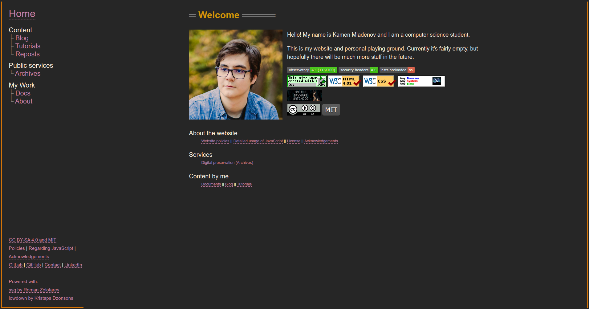
As for my own website, this is what it looked like by the time I made release 2.2:
There is no point in showing code blocks or other elements, since it was just a change of colors. But boy oh boy how long it took to make such a simple change. That’s where everything stayed for a while.
v3.0
#Of course, there were changes, I wrote more posts, tweaked some of the styling, hell, I even started adding (non required) JavaScript functionality. Still, I was yearning for something better. Scalability was continuing to be an issue, outside of the annoying misalignment, navigation buttons in the header or footer would disappear into the void if it’s contents were too long:
This example is unrealistic, but there were times where I wanted to put something longer in the footer button, and this issue arose. Also the whole button idea wasn’t very expandable, what if I wanted to have not 6 but more than 20 buttons in the header up top?
And don’t get me started on how comically bad this is on mobile:
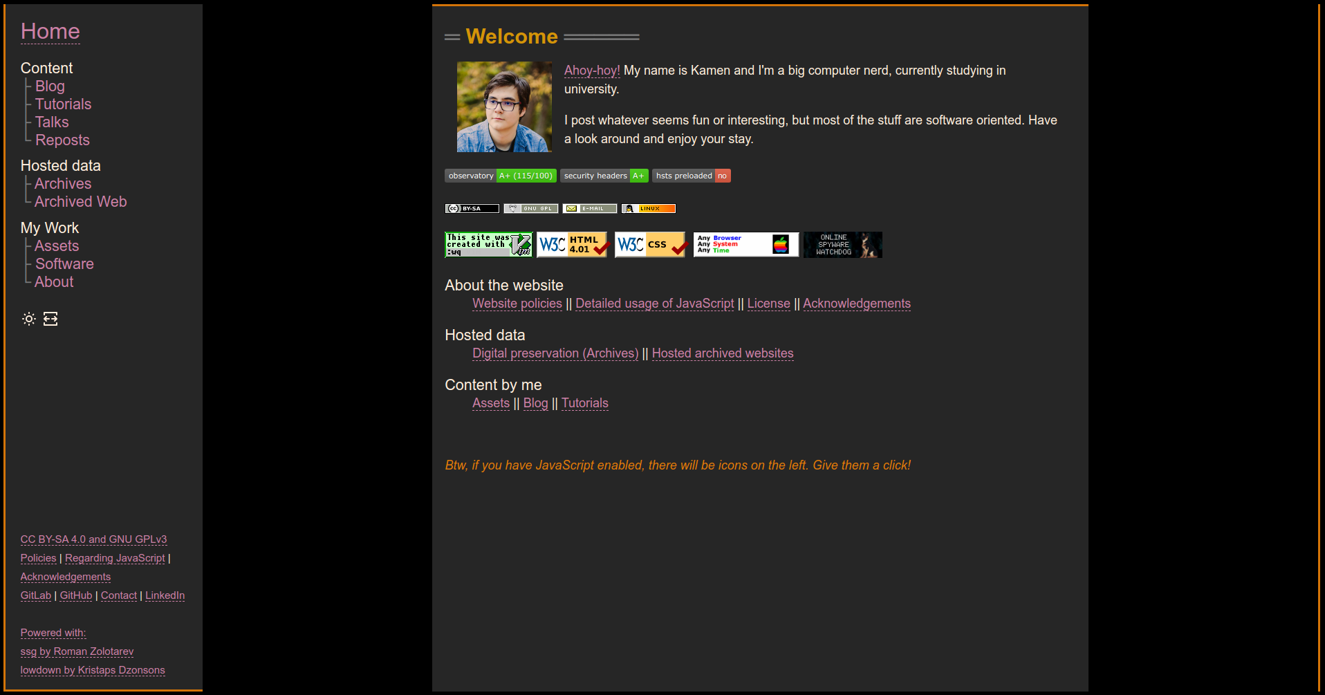
Something needed to change yet again, and something did. A year and a third later, on 3 July 2022, I went away with the tabbed-like button layout, and opted for a dead simple sidebar:
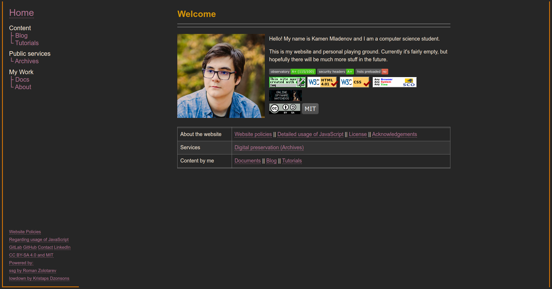
About that useless right border and the weird choice for only left and bottom borders on the sidebar: I wanted some separation for the sidebar and I wanted more “fun” in the overall design. Most of the inspiration for those came from Julia Evan’s blog, where there is a big orange ribbon running on the sides and across the page. Over time I did more tweaking on the colors and layout of everything, so by the time I created release 3.0, it looked like this:
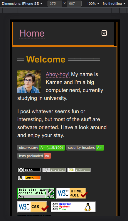
A good question you might be asking yourself is “How is this supposed to be scaleable?” The answer is that it kinda of wasn’t, at the time. On small screens, the sidebar was placed at the bottom of the page, that’s it. However this didn’t address the issue, just temporarily avoided it.
v3.1
#The keen eyed among you might’ve been asking an even better question “Did you learn nothing?” and the answer would be an unsure “No”
The whole point of DevHive’s final redesign was to use colors for better separation between items on a page, the final two concepts taught me that you need to separate different elements of a page, and to do that you need to both utilize color and borders. But that completely when over my head when I initially did that 3.0 redesign.
Fortunately, it later came back. It might’ve been four and a half months later, but I finally added color separation between the background and article and navbar.
And about that unfixed scalability? Well, I fixed it, now on a mobile devices, the navbar stays up top, but is shrunk and can be expanded with a button:
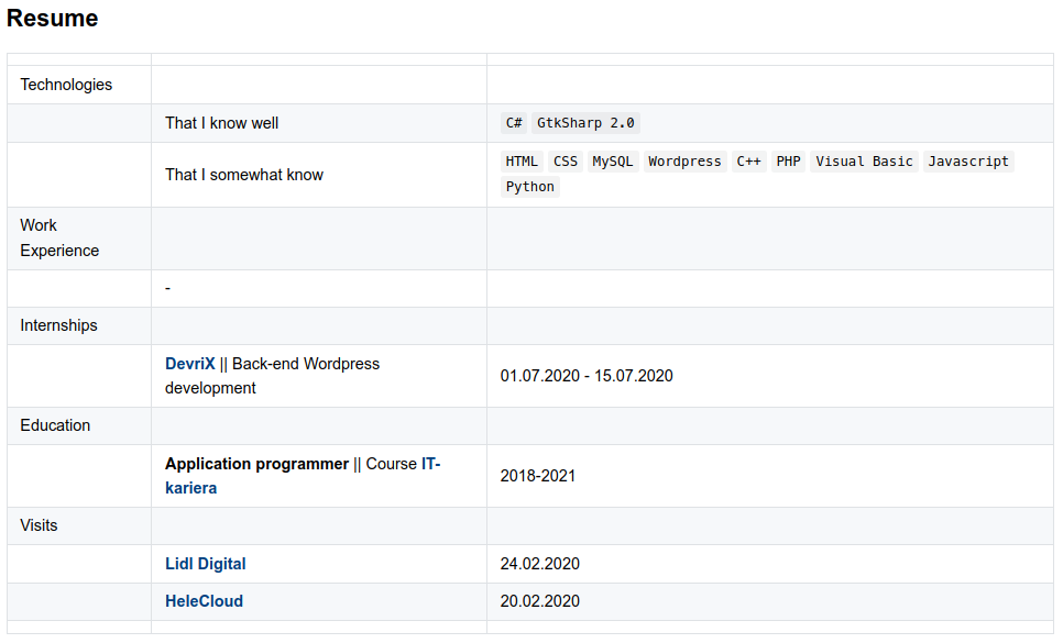
Another notable styling change was in tables. I pretty much stole the design from LEMMiNO’s website:
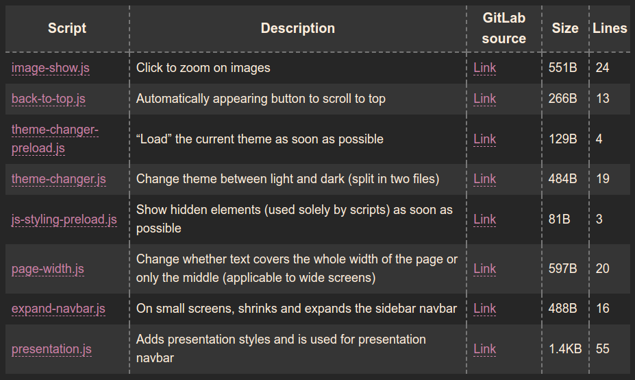
Finally, probably the most important change of it all, before I used some bash scripts to automate certain actions in the result HTML files, like generating the description automatically. Now, this was all done with awk, a programming language specifically designed for making text changes to files. awk’s flexibility permitted me to create stuff like the slide presentation system without too much trouble.
now
#As of the writing of this post, not too much has changed since the last release. There have been new posts, like this one and Taming the Fun-too but the overall design is here to stay, at least until I learn more about creating web styles and/or get bored of the current one.
Happy holidays everyone!
Appendix
#This post has been in the works since 01 August 2020.
At the time it was just called “syndamiadotcom” and was listed under the now defunct “Projects” section.
It was actually still available on the website, under /blog/syndamiadotcom/, but I didn’t list it in the blogs page.
That first iteration looked at the layout in a much stiffer and uninteresting way. I was talking about what exact color codes I used for crying out loud. But it was left as-is because I struggled on how to approach it. I’m still not entirely happy with this version either, v2.2 was probably the most interesting and valuable part of the whole thing and the rest was fairly meh.
Oh well, maybe I’ll rewrite it again one day. However, for the time being, I believe it’s better for me to expect a bit less and just put stuff out there. As you saw, learning the little I know about web design was a slow trial and error process that took over 2 years (and is still ongoing). The same will happen with making blog posts and other articles. I’m not a writer and I’m not interested enough to learn things properly.
P.S. Expect this post to be updated in the future, when I make new releases!